Note: This is Part 3 of a series where I get an AI to build one SaaS landing page and then improve it, one small step at a time. In Part 1 I sent Claude one message and got a complete page for Cadence, a focus and habit tracker I invented for this series. In Part 2 I mapped the nine sections every SaaS page uses and where Cadence's page put them. This post changes nothing on the page. It's the diagnosis, with every tell named and screenshotted before any fix. No affiliate links, no sponsors.
In Part 1 I typed one sentence into an AI chat and got back a landing page that looked like it belonged to a funded startup. Dark hero, gradient headline, dashboard mockup, pricing table, footer with a legal section. Done, apparently.
And I knew it was fake the way you know a stock photo is a stock photo. I knew instantly, and without being able to say why. That bothered me more than the fakeness itself. "AI stuff looks like AI stuff" is a shrug, not an explanation. If I'm going to fix this page across the series, I need the actual list of specific things on this specific page that make it read as machine-made.
So that's this post. I scrolled the Cadence page top to bottom, wrote down every tell, and checked each one against the actual HTML the AI gave me. Nine made the list, and I sort them into three kinds at the end, because the difference matters for fixing them.
One test before the list
Here is the fastest check I know for AI-built (or just generic) pages. Cover the logo and ask which product this page is for. If the honest answer is "any of them," the page has no owner. Keep that test in mind, because about half the tells below are versions of it.
Tell 1 — The headline any app could wear
The Cadence hero says:
Turn intention into unbreakable habits Cadence blends deep-focus sessions with habit streaks so your best days stop being accidents.
Read it once and it sounds sharp. Read it twice and try the test: swap in any other habit app's name. Nothing breaks. "Turn intention into unbreakable habits" would work for every one of the hundreds of habit trackers that already exist. It says nothing that's true of this one. Even the poetic bit, "your best days stop being accidents," is a compliment to no feature in particular.
The model wrote this hero from the average of every startup page it has seen. Neither sentence names anything Cadence does that the other habit trackers don't.
Tell 2 — The default skin: dark navy, purple glow, a gradient phrase
The whole page wears the same outfit. Near-black background, a soft purple radial glow behind the hero, and a headline where "unbreakable habits" fades through a teal-to-purple gradient. Buttons are purple with a glowing shadow. Every corner on the page is rounded soft.
None of this was in my prompt. I said "modern and clean, like a startup." And this is what the internet's startups look like on average, which is exactly the problem. It's not ugly. It's a uniform. You've scrolled past this exact color scheme so many times that your brain files the page as "seen it" before reading a word.
Tell 3 — 12,000 users who have never existed
Right under the hero buttons, in small grey type:

Free forever plan · iOS, Android & Web · 4.9★ from 12,000+ users
Cadence has no app, App Store listing, users, or rating. It's a name I made up minutes before. The AI added the 4.9 stars and the 12,000 users on its own, because a startup page is supposed to have a proof line, and it filled the slot with the most convincing number it could generate. This is the tell I keep coming back to. The 4.9 stars and the 12,000 users are false, and they sit directly under the two hero buttons.
Tell 4 — The dashboard that is a drawing
Where a real product would show a screenshot, the page shows this:
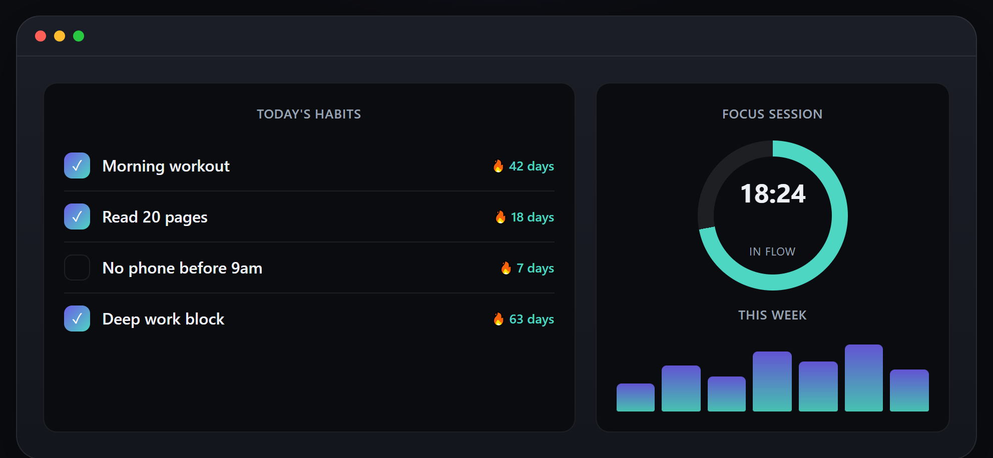
It has the three little Mac window dots. It has a habit checklist ("Morning workout — 42 days," "Deep work block — 63 days"). It has a focus ring frozen at 18:24 and a tidy seven-bar week chart. It looks like software. It is a picture of the idea of software. The AI can't screenshot a product that doesn't exist, so it drew what a habit tracker's dashboard should look like. Nothing in it is real data, and nothing in it ever changes.
Every number in it was drawn: 42 days, 63 days, 18:24, and seven bars that will read the same tomorrow.
Tell 5 — Trusted by six companies that don't exist
Below the hero, a classic logo strip:

Northwind. Loop&Co. Vertex. Fable. Meridian. Quanta. Six confident, corporate-sounding names, and not one of them is a company. They're plausible-name-shaped noises, generated to fill the "trusted by" pattern. The greyed-out styling even mimics how real logo strips dim their logos to look tasteful.
The strip claims trust from people at six companies, and all six were generated along with the strip.
Tell 6 — Features the product doesn't have
The feature grid lists six cards with emoji icons:
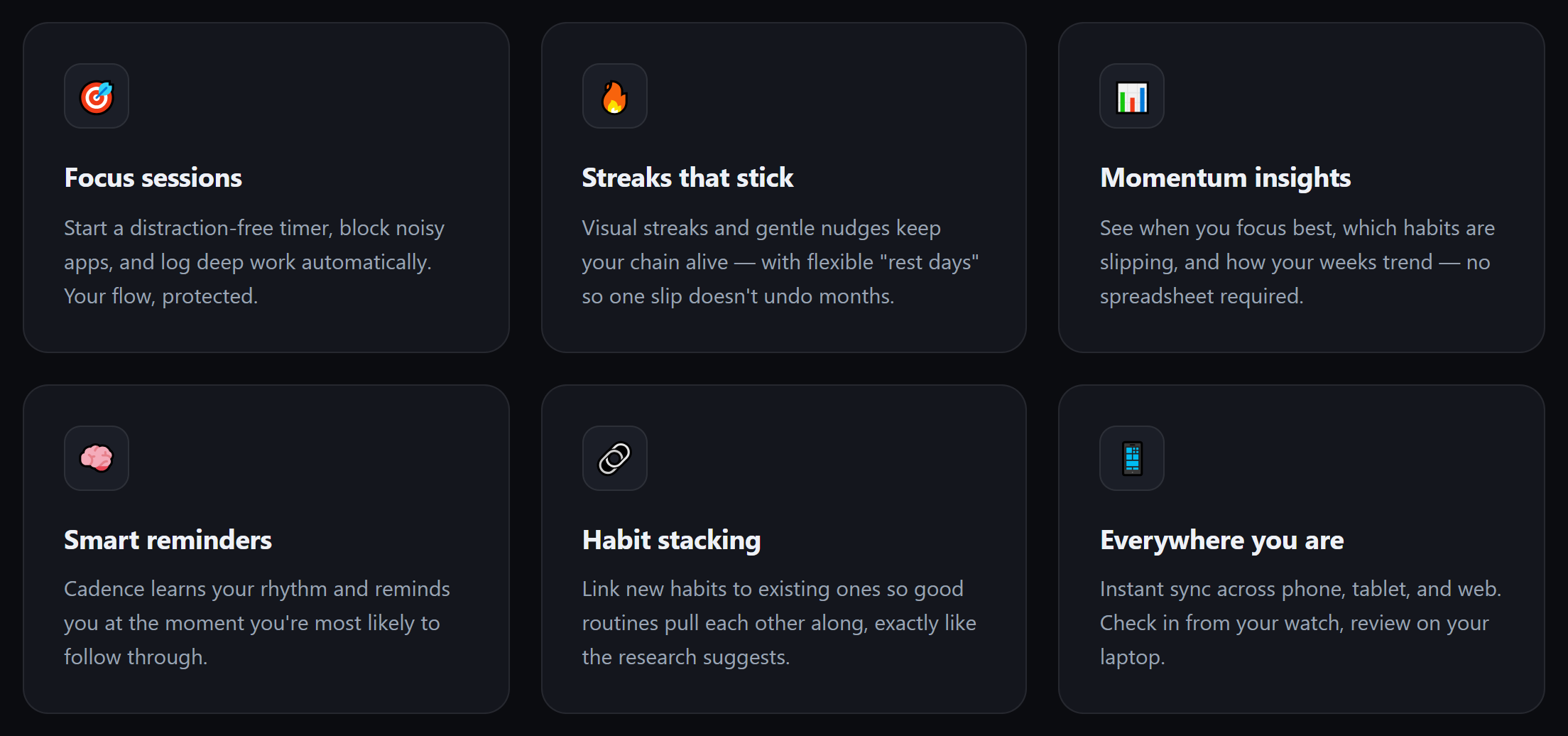
Focus sessions, streaks, insights, smart reminders, habit stacking, sync everywhere. Two problems.
First, the generic half, where "Everything you need to stay consistent" is another headline any app could wear, and half the cards describe virtues rather than mechanisms.
Second, the invented half, where a card promises that "Cadence learns your rhythm and reminds you at the moment you're most likely to follow through." That's a machine-learning feature. For an app with no code. The AI did more than describe a hypothetical product generously. It committed the product to specific capabilities nobody has built, in the confident present tense.
Tell 7 — The stats band doubles down
Remember the 12,000 users from Tell 3? That was the lie in small print. Further down the page, it graduates to a headline act. Here is the same fabrication, one level deeper, in 58-pixel type:

2.4M focus hours tracked. 89% keep a streak past 30 days. 4.9★ average app store rating. These are precise numbers rather than round marketing-ish ones, which is what makes them feel measured. There is no measurement. There is no app store listing to have a rating on. The 4.9★ from the hero returns here, now labeled "average app store rating." The fabrication has developed internal consistency, which is somehow worse.
Tell 8 — A pricing table for nothing
The page ends its sales pitch with a full three-tier pricing table:
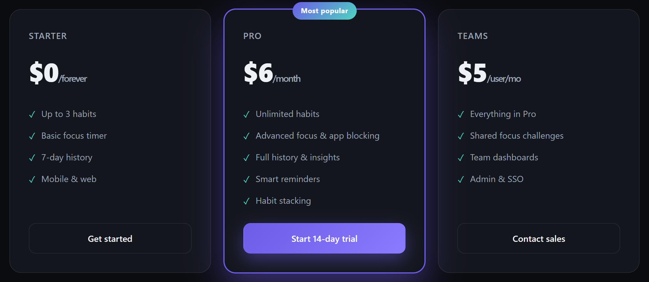
Starter, $0 forever. Pro, $6/month — tagged Most popular, with a 14-day trial. Teams, $5 per user, with "Admin & SSO" and a Contact sales button.
Every part of this is pattern-matching. "Most popular" is a claim about purchase data that doesn't exist. The 14-day trial is a policy nobody set. And "Contact sales." Whose sales? The AI reproduced the standard SaaS pricing page so faithfully that it priced a product with no code and staffed it with an imaginary sales team.
Tell 9 — Every road leads nowhere
The footer is my favorite tell, because it's the quietest:
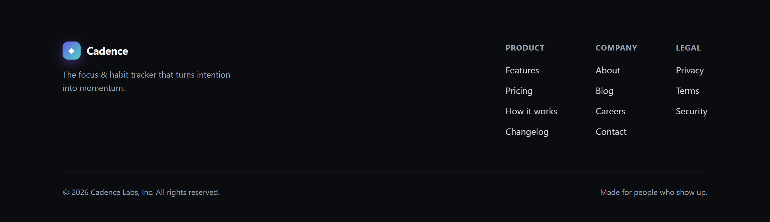
It has everything a real footer has, including Product, Company, and Legal columns. Changelog. Careers. Privacy. Terms. Security. A copyright line for "© 2026 Cadence Labs, Inc.", a corporation the AI founded in passing. And a tagline, "Made for people who show up."
Those links point to #, and so does "Log in," and so does every button on the page. Nowhere. Real sites accumulate their footers link by link over years, because each one leads to something that had to be built. Here all three columns appeared at once, and none of the links has anything behind it.
The scorecard
Nine tells; my page has all nine. But sorting them taught me more than counting them, because they fall into three kinds:
- Borrowed — the average of everything the model has seen. The interchangeable headline, the purple-glow uniform, the virtue cards. Even the section order (hero → logos → features → stats → steps → pricing → CTA) is the statistically standard spine.
- Invented — statements that are simply false. The 12,000 users, the 4.9★, the six companies, the ML feature, the "most popular" tier, Cadence Labs, Inc.
- Hollow — structure with nothing behind it. The drawn dashboard, the
#links, the sales team you can't contact.
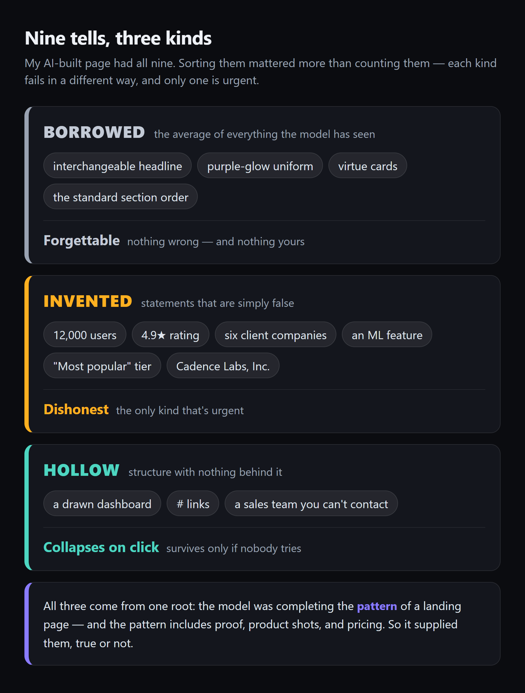
The borrowed parts make the page forgettable. The invented parts make it dishonest. The hollow parts make it collapse the moment anyone clicks. And all three come from the same root. The model was completing the pattern of a landing page, and the pattern includes proof, product shots, and pricing. So it supplied them, true or not.
Worth saying plainly: none of this means the AI failed. I asked for a startup landing page from one sentence, and it delivered the most standard possible one, fast and free. The failure would be shipping it as-is. The list showed me where the work actually is. An AI page still needs someone to go through it afterwards and make every borrowed thing specific, every invented thing true, and every hollow thing real. Which is the rest of this series.
What's next
Diagnosis done. The page's problems now have names. In Part 4, the first fix, and it isn't a design fix. The lies come off the page. Every invented number, logo, statistic, and claim gets deleted, and we see what the page looks like when only true things remain. (Spoiler: much emptier, and already more trustworthy.) After that, the rebuild starts one concept per post, working through structure, spacing, typography, color, and buttons. Same product, same rule as always: no code I couldn't paste from a chat.
FAQ
Did the AI really invent the users and companies, or were they in your prompt?
Invented, unprompted. The full prompt from Part 1 was one sentence: the app's name, its category, and "make it look modern and clean, like a startup." The 12,000 users, the 4.9-star rating, the six company names, the stats band, and "Cadence Labs, Inc." all came from the AI filling in the slots a startup page normally has. That's the core finding of this post. The pattern includes proof, so the model fabricates proof.
Why do AI-generated websites all look the same?
Because the model produces something close to the average of the thousands of landing pages it learned from. The average is a dark hero, a gradient accent, a logo strip, feature cards, stats, and three-tier pricing, in that order. Nothing in that layout points at one particular product, which is why the look reads as anonymous even when nothing is technically wrong.
How do I check whether my own page has these tells?
Start with the cover-the-logo test. Hide your name and ask if the page could sell a competitor unchanged. Then scan for the three families. Borrowed (could any app say this?), invented (can I point to the source of every number, name, and quote?), and hollow (does every link and screenshot lead to something real?). A page passes when the answers are no, yes, and yes.
Are you going to fix all nine?
Yes, but spread across the series rather than in one pass. Part 4 removes everything invented, because false claims are the only tell that's urgent rather than just embarrassing. The posts after that fix the borrowed and hollow parts one concept at a time, going through page structure, spacing, typography, color, and the rest, so the page improves for reasons I can actually explain.