Note: This is Part 2 of a series improving one AI-built SaaS landing page step by step, learning web design as we go. Part 1 is the one-message build of Cadence, the demo product I invented. No affiliate links, no sponsors.
I own a landing page now. The AI wrote it in Part 1 from a single sentence. It's about 21 kilobytes of HTML I can't read, rendering a page that looks finished and isn't mine in any way that matters.
Before I change a single color or word on it, I need to know what I'm looking at. I don't mean "learn to code," which I still can't do and which this series won't require. I mean something smaller and more useful. I want to know what the pieces of a landing page are, why they sit in the order they do, and what each one is for. That turns out to be what everything else in this series depends on. Once you can name the parts of a page, you can tell the AI to change one of them and leave the rest alone.
So: lesson one. The anatomy of a landing page.
A landing page is a conversation
One idea made structure click for me. A landing page works less like a poster and more like a script for a conversation with a stranger who might leave at any second. Every section exists to answer the question that stranger is silently asking at that exact moment. The sections are ordered because the questions come in order:
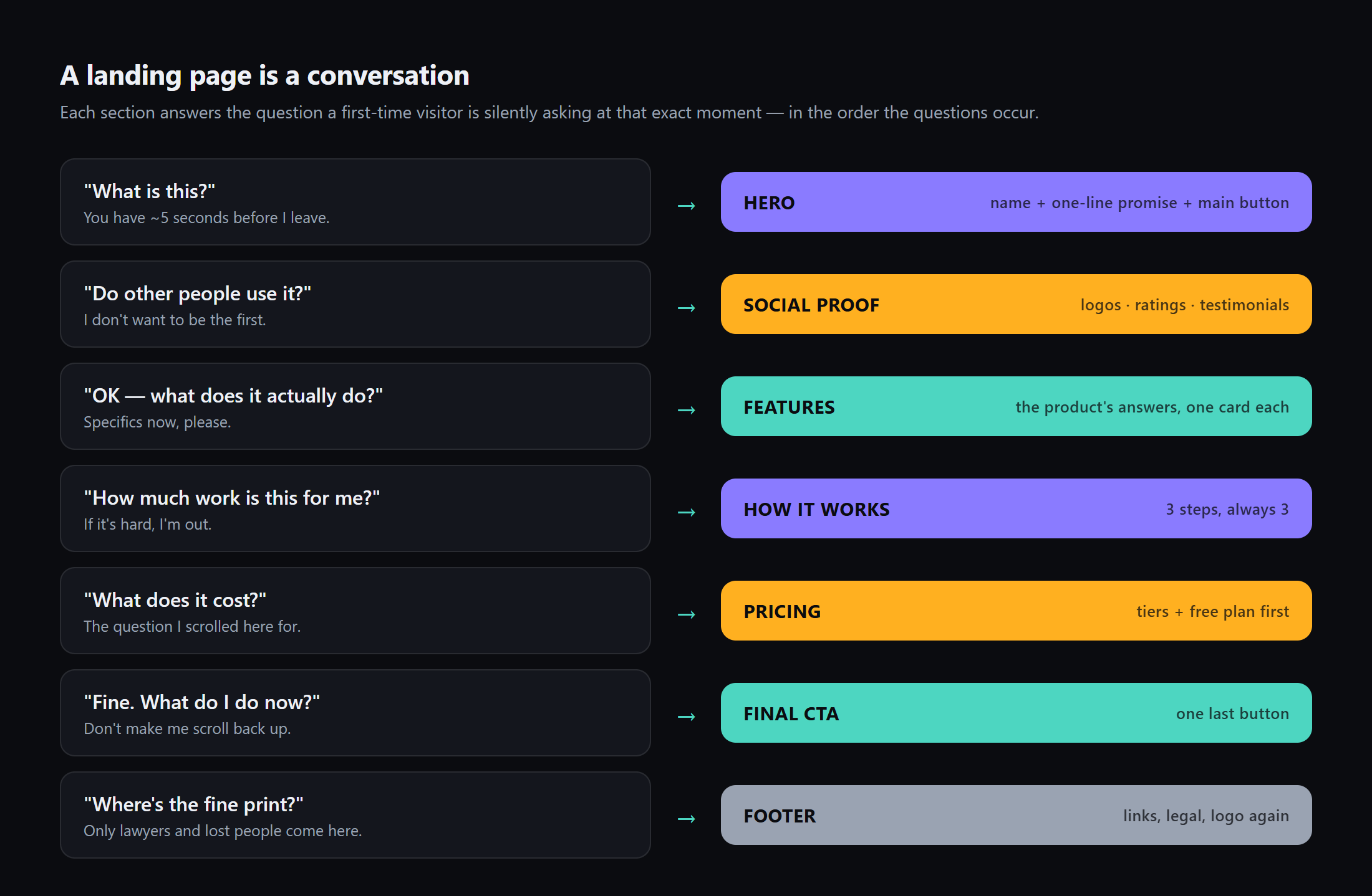
Read the left column top to bottom and you can feel yourself doing it. It's exactly how you behave on every product site you've ever visited. You give the hero five seconds. You glance for signs of life. You scroll to see what the thing does, check what it costs, and either leave or click the button.
This explains something that bugged me in Part 1. Every SaaS page has the same layout. It's not laziness. The structure is the same for the same reason every restaurant menu lists food before prices. It follows the order in which people decide. Structure is convention, and a visitor who has seen a thousand landing pages already knows how to read yours.
That sets up the rule I'll lean on for this whole series. The skeleton should be conventional; the skin and the words should be yours. When a page feels generic, the problem is almost never that pricing comes after features. It's what's inside the sections. We'll get there.
The skeleton, exposed
Armed with that model, I went back to my AI-built page and labeled it. The entire Cadence page, with its skeleton drawn on:
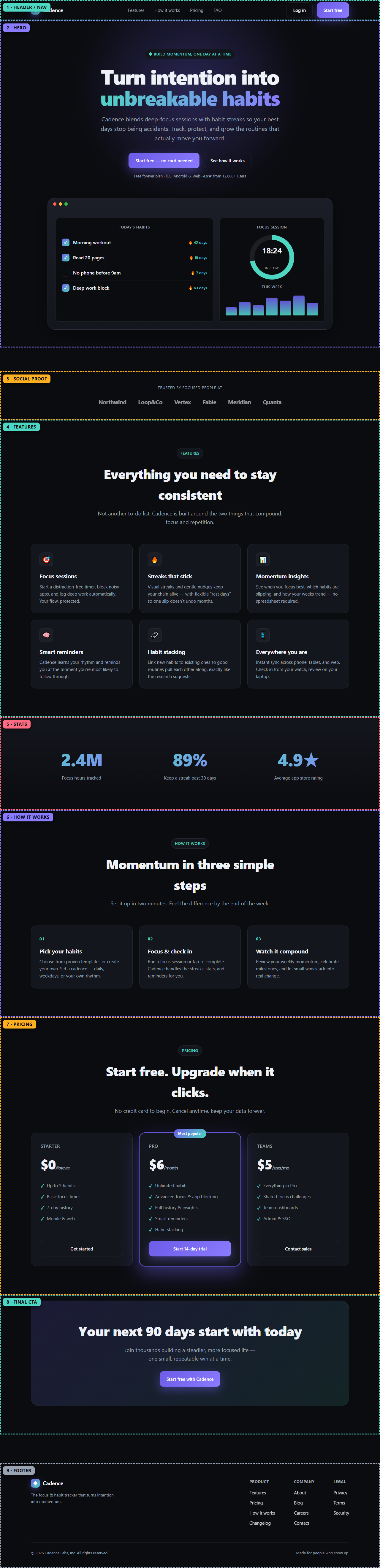
Nine sections, in the canonical order:
- Header / nav — the page's spine: logo left, links middle, "Start free" button right.
- Hero — the five-second pitch: headline, one paragraph, two buttons.
- Social proof strip — the "signs of life" bar (hold this thought).
- Features — six cards of what the product does.
- Stats — big numbers meant to build trust.
- How it works — three steps. It's always three steps.
- Pricing — three tiers, middle one highlighted. Also always.
- Final CTA — one last button for the fully scrolled.
- Footer — links, legal, logo again.
The AI got the structure completely right, which surprised me. Textbook, actually. Of all the things I could criticize about this page from Part 1, the skeleton isn't one of them. That makes sense once you know how these models work. They're trained on thousands of landing pages, and the one thing they absolutely absorb is the consensus order. Structure is where the "average of everything" instinct helps rather than hurts.
Reading the code without reading the code
I said I can't read 21KB of HTML, and I can't. But I learned I don't have to. HTML is just labeled boxes inside labeled boxes, and the labels are English.
I opened the file and ignored everything except lines that start a box. What's left is the whole page in twelve lines:
<header class="nav">        …the nav bar…
<main>
  <section class="hero">    …headline, buttons, proof line…
    <div class="mock">      …the fake dashboard drawing…
  <div class="strip">       …"Trusted by" logo bar…
  <section id="features">   …six feature cards…
  <section class="stats">   …2.4M / 89% / 4.9★…
  <section id="how">        …three steps…
  <section id="pricing">    …three plans…
  <section id="faq">        …final call-to-action band…
</main>
<footer>                    …link columns, copyright…
That's it. The page, in twelve lines. Every landing page you've ever seen collapses to a list like this, and you can see any site's version yourself. Right-click → Inspect, and click the little arrows to fold the boxes closed. The 21KB stopped being scary once I saw that most of it is styling. Colors, sizes and spacing, wrapped around these twelve lines.
There's an even easier way, since I have an AI on hand. I pasted the file into the chat and asked it to "list the sections of this page and what each one is for." It narrated its own work, section by section. The thing that wrote the code is also the best tutor for reading it. That one's going in my permanent toolkit.
Why names matter: my first structural edit
Now the payoff. In Part 1, my one-sentence prompt got me a whole page because the AI filled in every blank. The cost was control: I couldn't steer parts of it, because I had no words for the parts. Regenerating the whole page just reshuffles everything at once.
But now the parts have names. So I can operate.
And there's an obvious first operation. Look at sections 3 and 5. Those are the social proof strip and the stats band. Their job, per the conversation model, is to answer "Do other people use it?" with evidence. Cadence has no users; the AI answered anyway, with six invented company names and statistics from nowhere (I'll dig into that habit properly in the copy-and-trust part of this series). My page currently answers a trust question with fiction.
Structure gives me a cleaner option than fixing the fiction. A section whose question you can't honestly answer yet shouldn't be on the page. Skipping a question is fine, and plenty of young products launch with no logo bar. Answering it falsely is not. So both sections go, and they can return the day there's something true to put in them.
Here's the exact message I sent Claude, using the section names:
"Remove the 'Trusted by focused people at' logo strip section and the stats section (the one with 2.4M / 89% / 4.9★) entirely. Don't change anything else."
It returned the full file with both blocks gone and everything else untouched. I checked by comparing the two files, and the only difference was the removed sections. No regeneration lottery, no reshuffled page. Naming the target is what made a one-line instruction remove exactly the two sections I named and nothing else.
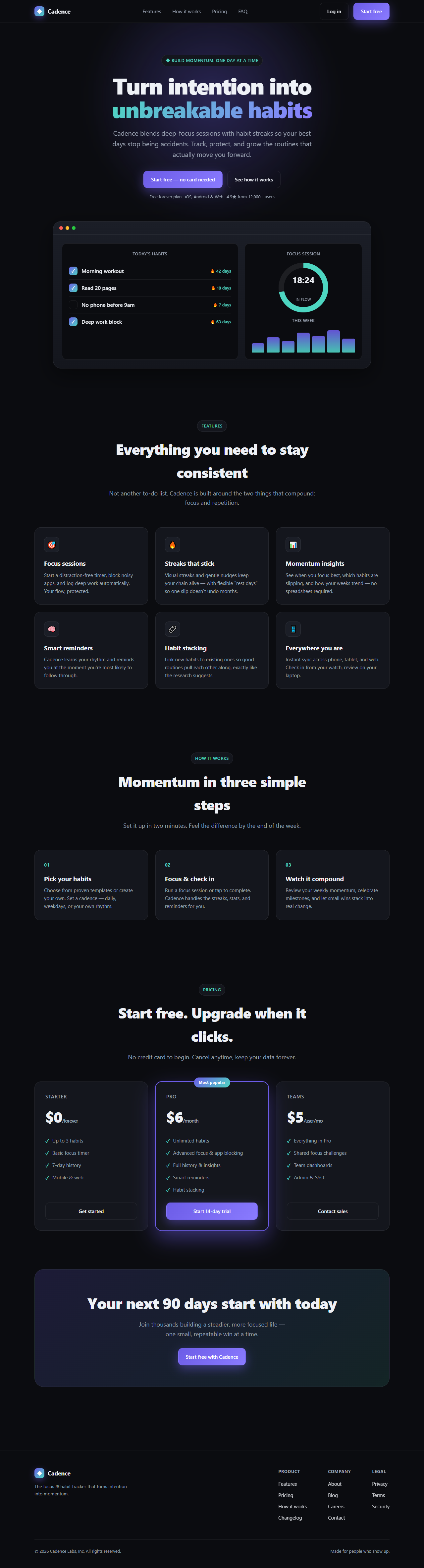
The page is two sections shorter and nothing of value is missing. The conversation just skips a question it couldn't honestly answer. I should be clear about what this didn't fix. The hero's small print still claims "4.9★ from 12,000+ users," and the pricing table is still invented. Those are content problems living inside otherwise-legitimate sections, and content gets its own part later in the series. Today was about the skeleton, and every section still on the page has a real job.
What you actually learned (the recap)
- A landing page is an ordered conversation. Each section answers one visitor question, in the order the questions occur. That ordering is why the layout is so consistent across the industry, and why you should keep it.
- Any page collapses to a ~12-line skeleton of labeled boxes. You can read yours with Inspect, or ask the AI to narrate its own file.
- Names give you surgical control. "Remove the logo strip section" works; "make it better" reshuffles. That mechanic carries the whole series. Learn the concept → gain the vocabulary → direct the AI precisely.
- A section earns its place by doing its job. If its question can't be answered truthfully yet, cut the section.
The full series (so you know where this goes)
Following the classic web-design curriculum, one concept per part, all on this same page:
- Building the page with one AI message ✅
- Web page structure — this post ✅
- Text and typography — rebuilding the hero headline
- The box model and spacing
- Flexbox — how things line up
- CSS Grid — the feature and pricing layouts
- Responsive design — surviving the phone
- Color and images — retiring the purple uniform
- Buttons, links, and interactions
- Cards, lists, and tables
- Forms — a signup that actually works
- Copy and trust — real words, real numbers
- A one-page design system + the finished page
Part 3 takes on typography, asking why the hero headline is set the way it is, what a type scale is, and whether "Turn intention into unbreakable habits" survives contact with an actual lesson in hierarchy. Same product, same rule, with no code I couldn't paste from a chat.
FAQ
What are the standard sections of a SaaS landing page?
Nine, in a fairly fixed order: header with navigation, hero (headline plus main button), social proof (logos, ratings, or testimonials), features, stats, how-it-works steps, pricing, a final call-to-action, and a footer. Each one answers a specific question a first-time visitor asks. What is this, can I trust it, what does it do, how much effort is it, what does it cost, and what do I do now?
Why do all SaaS landing pages use the same structure?
Because the structure follows the order in which visitors make decisions, and that order doesn't change from product to product. A conventional skeleton is a courtesy. People who've seen a thousand landing pages instantly know how to read yours. Originality belongs in the copy, imagery, and design inside the sections. Reordering the conversation is not the place for it.
Do I need to learn HTML to improve an AI-built page?
No. You need to recognize the skeleton, roughly a dozen lines of labeled boxes like <section id="pricing">. You can see it with your browser's Inspect tool, or ask the AI to list its own sections. Once you can name a section, you can tell the AI to change exactly that section and nothing else, which is the only technical skill this series actually depends on.
Is it okay to delete sections from a generated landing page?
Yes. Deleting is often the most honest edit available. Each section exists to answer a visitor's question, and if you can't answer truthfully yet (no users for the social proof bar, no data for a stats band), skipping the question reads far better than faking the answer. Ask the AI to remove the named section entirely, and reintroduce it when you have something real to show.