Note: This is Part 1 of a series where I get an AI to build one SaaS landing page and then improve it, one small step at a time. The product is Cadence, a focus and habit tracker I invented as a demo so I could show the whole process on something real without pretending it's a company or borrowing someone else's name. This first post covers just the build, the message I sent and the page that came back. No affiliate links, no sponsors. Just what happened.
I can't code. I can't design. I've abandoned enough half-built side projects to know the wall I hit is always the same one, and it's not the idea or the feature list. It's the landing page. The moment where you're supposed to produce something that looks like a real product instead of a homework assignment, and you open a blank file and just... close it again.
So this time I skipped the file. I opened Claude, the same AI chat box I'd normally use to rewrite an email, and asked it to build the page for me. No design tool. No template gallery. No dragging boxes around. I typed one message and waited.
What came back looked like it belonged to a funded startup. The good part turned out to be the whole problem too — but I'll get to that. Here's the build, start to finish, because the speed is real and worth watching.
Why I invented a product first
You need a product before you can have a landing page. The AI needs something to sell, and I didn't want to grab a real company's name and put words in their mouth. So I made one up that I'd actually use.
Cadence is a focus and habit tracker. The pitch in my head: most habit apps make you juggle twenty habits at once until you quit all of them. Cadence would track the routines you're actually trying to keep and help you protect your focus time around them. That's it. One job.
I'm going to keep improving this same page across the whole series, so Cadence is the spine of it. Right now it's a name and a sentence, which is all the AI needs.
I also picked a habit tracker on purpose, for the boring reason that it's a crowded category, and there are hundreds of them. If an AI reaches for something generic, a crowded category is exactly where you'll spot it, because "productivity app landing page" is a look we've all scrolled past a thousand times. I wanted to see the average version of that page, and a category this crowded is the fastest way to summon it.
The build: one message, one page
I didn't open a design app or a page builder. I opened Claude, the chat, and typed a single message. Here it is, word for word:
"I want a landing page for my app. It is called Cadence and it is a focus and habit tracker. Make it look modern and clean, like a startup."
Nothing else went into the prompt, and I didn't name a color, a font, a layout, a section order, or a single feature. A name, a category, and "modern and clean, like a startup." Then I hit send.
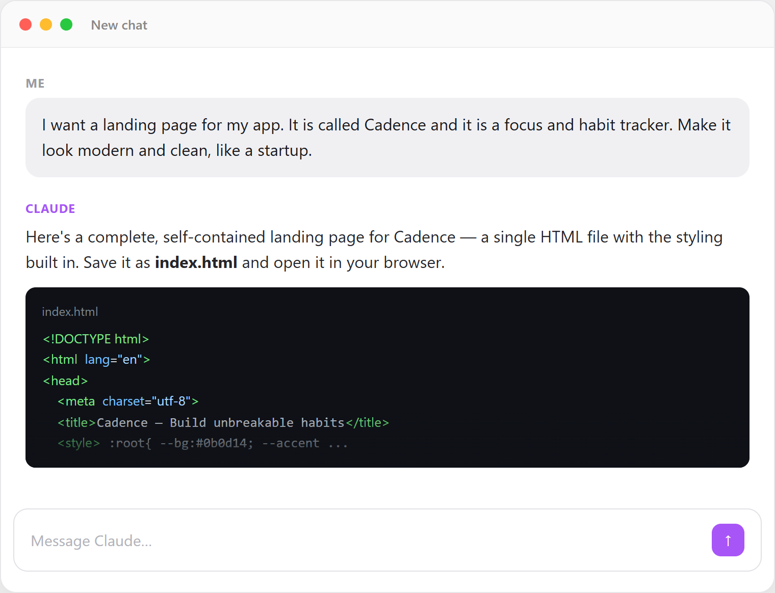
It didn't hand me a picture. It wrote the actual page, a single file of HTML and CSS I could save and open in a browser. About 21 kilobytes of code, none of which I wrote or understood, and when I opened it, this is what filled the screen.
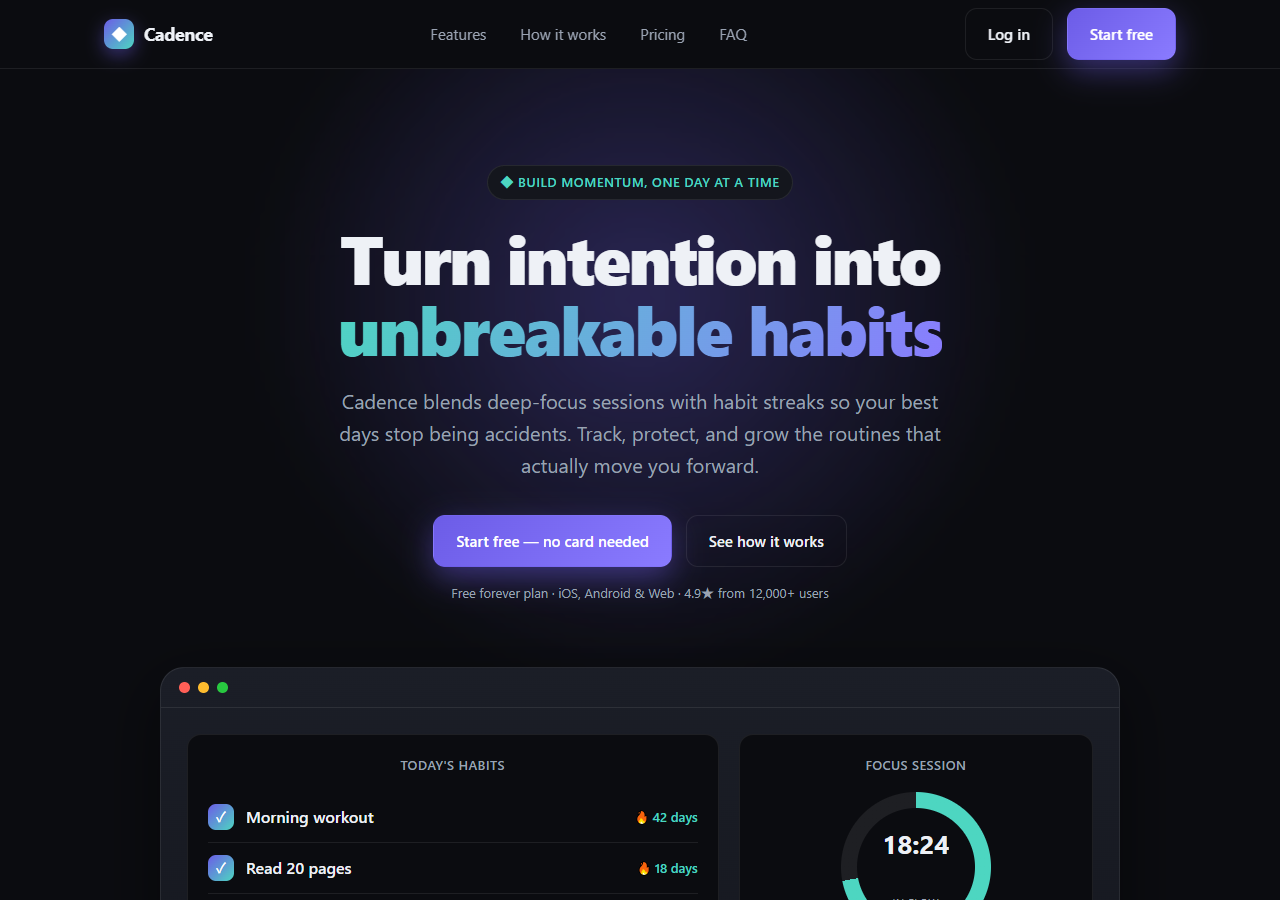
Here's what came out, top to bottom.
The hero. A dark navy background, a soft purple glow behind the text, and a big centered headline where the second line fades into a teal-to-purple gradient:
Turn intention into unbreakable habits Cadence blends deep-focus sessions with habit streaks so your best days stop being accidents. Track, protect, and grow the routines that actually move you forward.
Two buttons under it: a purple Start free — no card needed and a quieter See how it works. Above them, a little pill that read "Build momentum, one day at a time."
The proof line. Directly under the buttons, one small grey line:
Free forever plan · iOS, Android & Web · 4.9★ from 12,000+ users
Read that again. Cadence is a name I made up a few minutes earlier. It doesn't have an app, an App Store page, users, or a rating. The AI gave it 12,000 of them and a 4.9-star average, unprompted, because a startup page is supposed to have that shape. It filled in the blank with the most convincing number it could, and the number was a fabrication. I'll come back to this, because it's the whole reason you have to read what these things build for you.
The mockup. Where a screenshot of the real app would normally go, it drew a fake dashboard, a dark panel titled Today's Habits with a checklist ("Morning workout — 42 days," "Read 20 pages — 18 days," "Deep work block — 63 days"), and beside it a Focus Session panel with a progress ring frozen at 18:24 · In flow and a little bar chart labeled This week. It looks like a working product, but nothing in it is clickable. It's a drawing.
The rest. Scroll down and there was more, all invented in the same breath: a "Trusted by focused people at" strip with six made-up company names (Northwind, Vertex, Meridian and friends), a six-card feature grid, a stats band reading 2.4M focus hours tracked · 89% keep a streak past 30 days · 4.9★, a three-step "How it works," a three-tier pricing table ($0 forever / $6 Pro / $5 per user for Teams), and a footer crediting "© 2026 Cadence Labs, Inc."
That's a complete landing page. Hero, social proof, features, stats, pricing, footer, invented company and all, from one plain-English message. If you've ever stared at an empty design file at 11pm, you understand why my first honest reaction was relief.
The full page, top to bottom, with every section built from that one sentence.
First impression: it looks done — and something's off
I sat back and two thoughts arrived almost together.
First: this is genuinely impressive. I got past the wall. The page that usually kills my side projects took one message and cost nothing, and it looks more finished than anything I'd have built by hand in a week.
Then, half a second later: I've seen this page before. Not this exact page, this kind of page. The dark gradient, the one-word-swap headline, the "12,000+ users" for a product that doesn't exist, the frozen dashboard mockup. Change "Cadence" to any other app name and nothing breaks. It's the look you scroll past without reading.
The part that nagged at me is that nothing on it is technically wrong. The grammar is clean, the spacing is even, the colors work together. And it still reads as fake. It reads like a page a machine assembled, not something a person made for a thing they actually care about. I knew it the way you know a stock photo is a stock photo. Instantly, and without being able to say why.
That "without being able to say why" is what I couldn't let go of. It's easy to shrug and say "AI made it, of course it looks like AI." I wanted the specific reasons, the exact things on this page that give it away. And I wanted to know whether each one could be fixed by someone who can't design and can't code. Someone like me.
What's next
So that's Part 1: one message in, a finished-looking SaaS page out, no code and no design tool touched. The AI did its job a little too well — it even invented the users, the rating, and the company name to make the page feel real. The output looks done and feels hollow, and I still can't say exactly why.
In Part 2, the learning starts with the basic structure of a web page. I take this exact Cadence page apart section by section: what each piece is for, why landing pages are ordered the way they are, and how understanding the skeleton lets me direct the AI precisely instead of regenerating and hoping. After that, one concept per part: typography, spacing, layout, color, buttons, all the way to a finished page. The invented numbers and the swap-any-name headline get fixed along the way. Same product. No new tools. No code I couldn't paste from a chat.
FAQ
What did you actually use to build the page?
Just Claude, the same AI chat text box you'd use to summarize an article. I didn't use a website builder, a template, or a design tool. I typed one message describing the app and asked for a landing page, and it wrote the whole thing as HTML and CSS I could save and open in a browser. Roughly 21 kilobytes of code, none of which I wrote or understood.
Do you need to know how to code to do this?
No. That was the point of the experiment, since I can't code or design. You describe what you're selling in plain English and the AI produces the page. The catch, which is what the rest of the series is about, is that the first result looks generic and even invents fake details, so the real work is understanding and fixing what it hands you rather than building from scratch.
Is Cadence a real app I can download?
No. Cadence is a demo product I invented for this series so I could show the whole build-and-fix process on something concrete. It's a focus and habit tracker on paper only. Inventing it also surfaced the most interesting part of the experiment. The AI confidently gave a nonexistent app "12,000+ users" and a "4.9-star" rating, which is exactly the kind of thing you'd never want on a page you actually shipped.
Why did the AI add users and a rating I never asked for?
Because a startup landing page usually has social proof, and the AI is matching that pattern. When there's a blank where a number should go, it fills it with the most convincing-looking value rather than leaving it empty or asking. That's harmless in a demo and a real problem on a live page, and it's the single clearest reason to read, and edit, everything one of these tools generates for you.